- Client
- MyDocX
- Sector
- Health · telehealth
- Year
- 2025–2026
- Role
- Brand identity · Positioning · Website strategy · SEO & content
- Status
- Paused by client
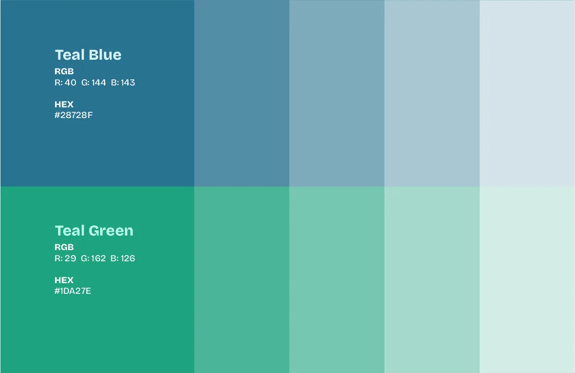
- Palette
01
The problem
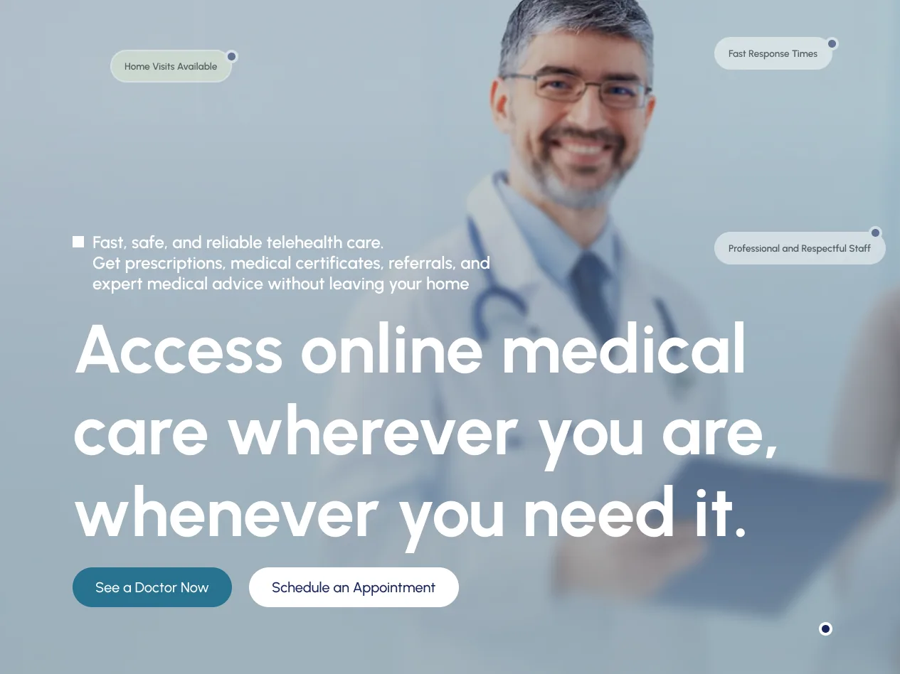
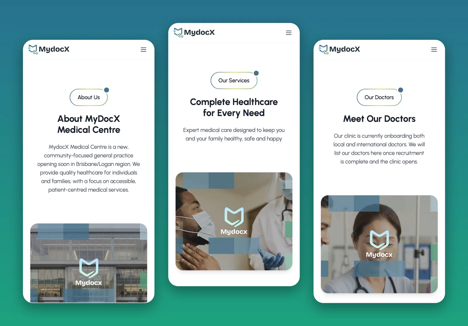
A national telehealth platform whose website read like a local clinic “opening soon”. Every page shared one title, and doctors had no real way to apply.
02
The thinking
Most of the site was already built. The gap was the words. So I audited every page live and wrote one change brief: national framing, a unique title per page, clear compliance copy and a doctor application form.
03
What I made
- Brand identity: logo system, palette, business cards
- Page-by-page live audit
- Website change brief for the developer
- Search fixes: titles, descriptions, headings
- Compliance-aware content direction
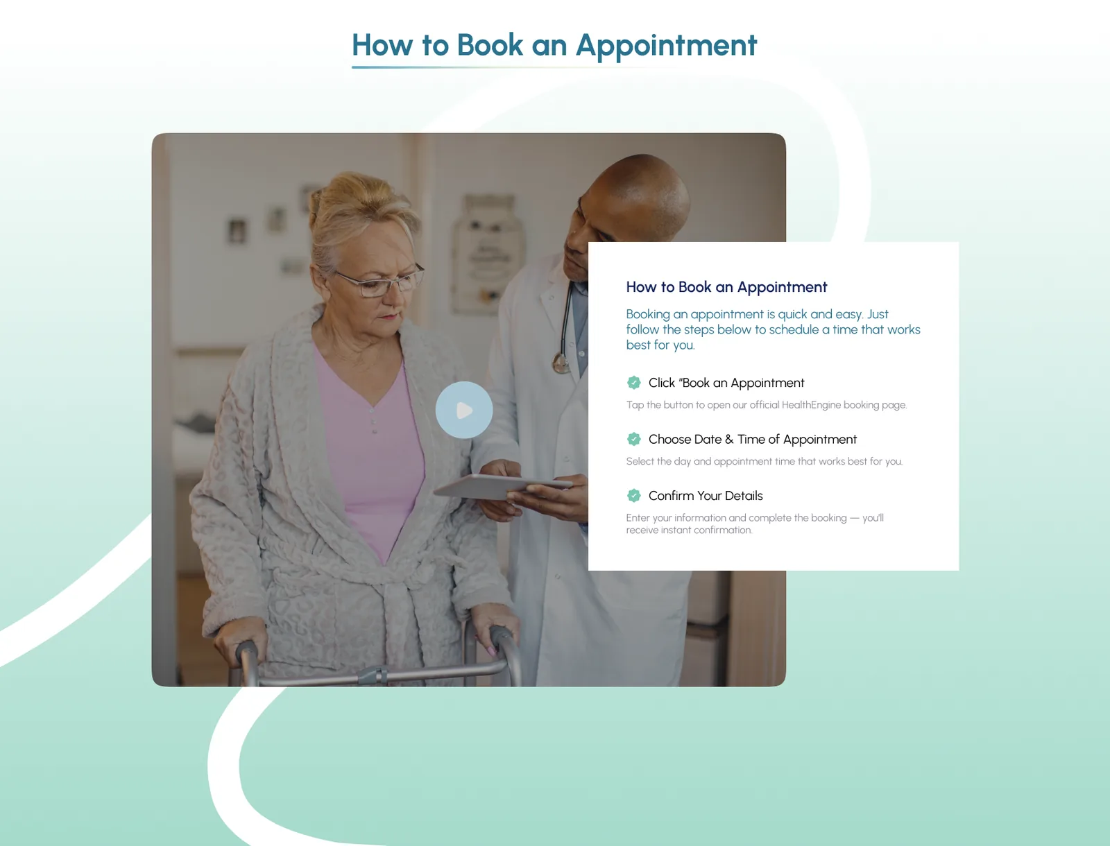
- Doctor application form spec

Result04
Paused by client
Brand delivered. Website relaunch paused by the client.
- 16pages briefed, one by one
- 1change brief for the developer
The work05