- Client
- Mary’s Bole Joint
- Sector
- Food
- Year
- 2025
- Role
- Brand strategy · Brand identity · Packaging · Social direction
- Status
- Identity delivered, 2025
- Palette
01
The problem
A mobile kitchen serving Nigerian traditional meals in Australia. It needed to feel like home to Nigerians and inviting to everyone else.
02
The thinking
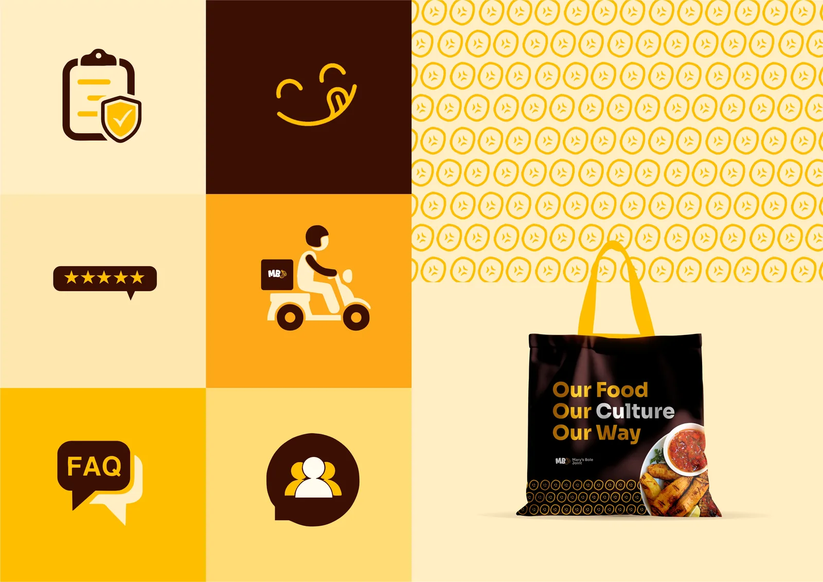
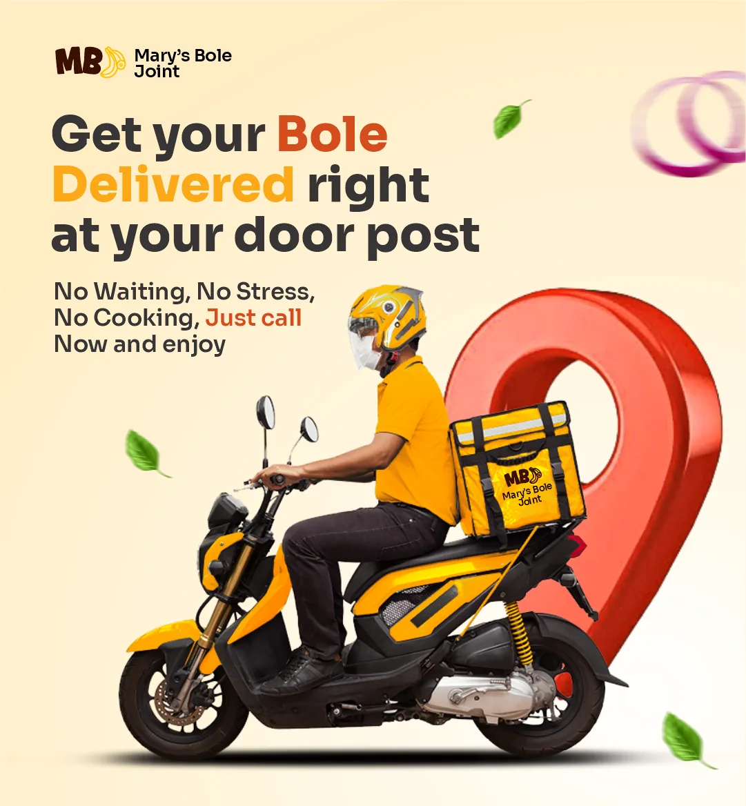
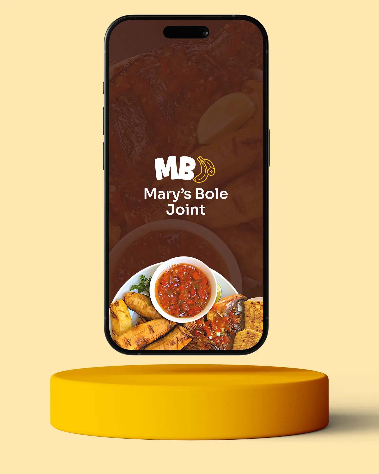
Food is bought with the eyes first. So the colour does the selling, warm and appetising, the “J” is shaped to feel friendly, and the pattern carries the culture so the words don’t have to.
03
What I made
- Brand strategy and values
- Logo system
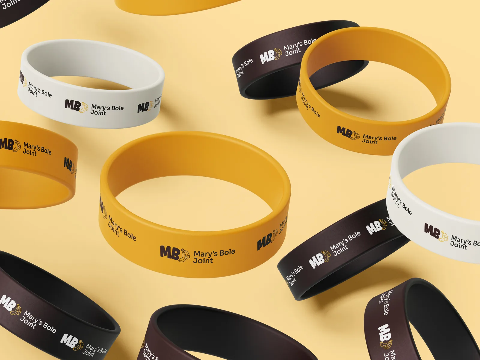
- Colour, type and pattern
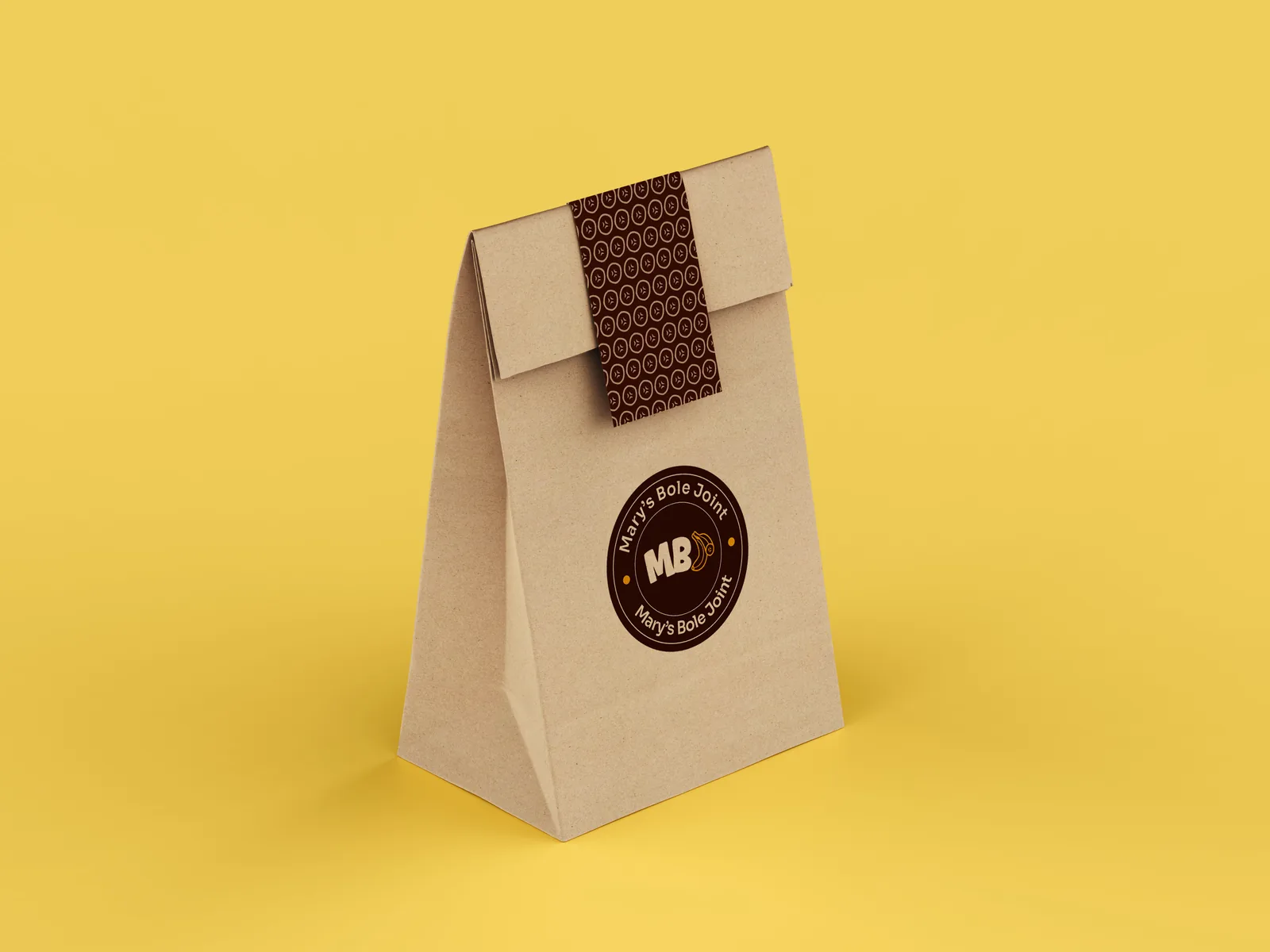
- Packaging and stickers
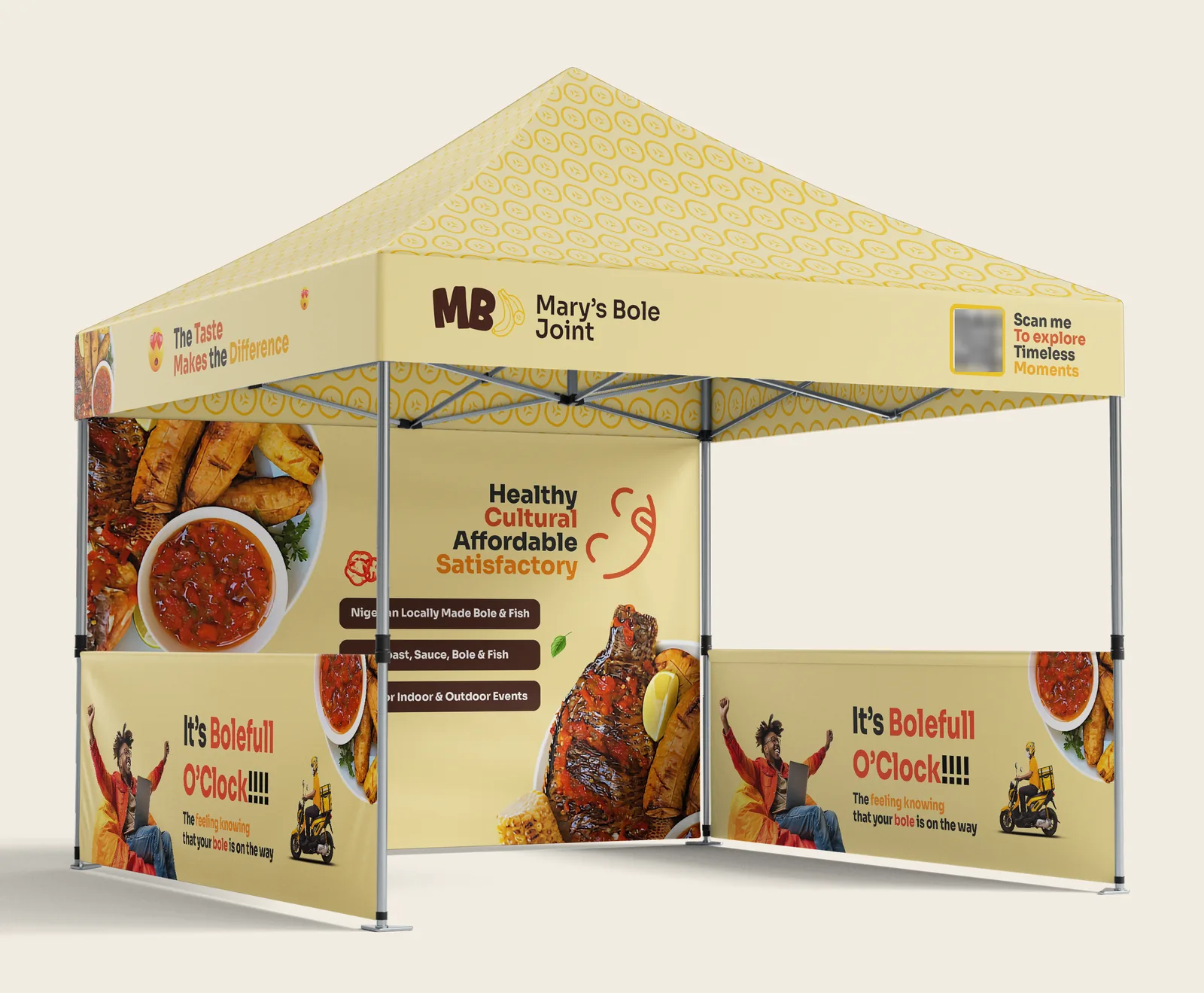
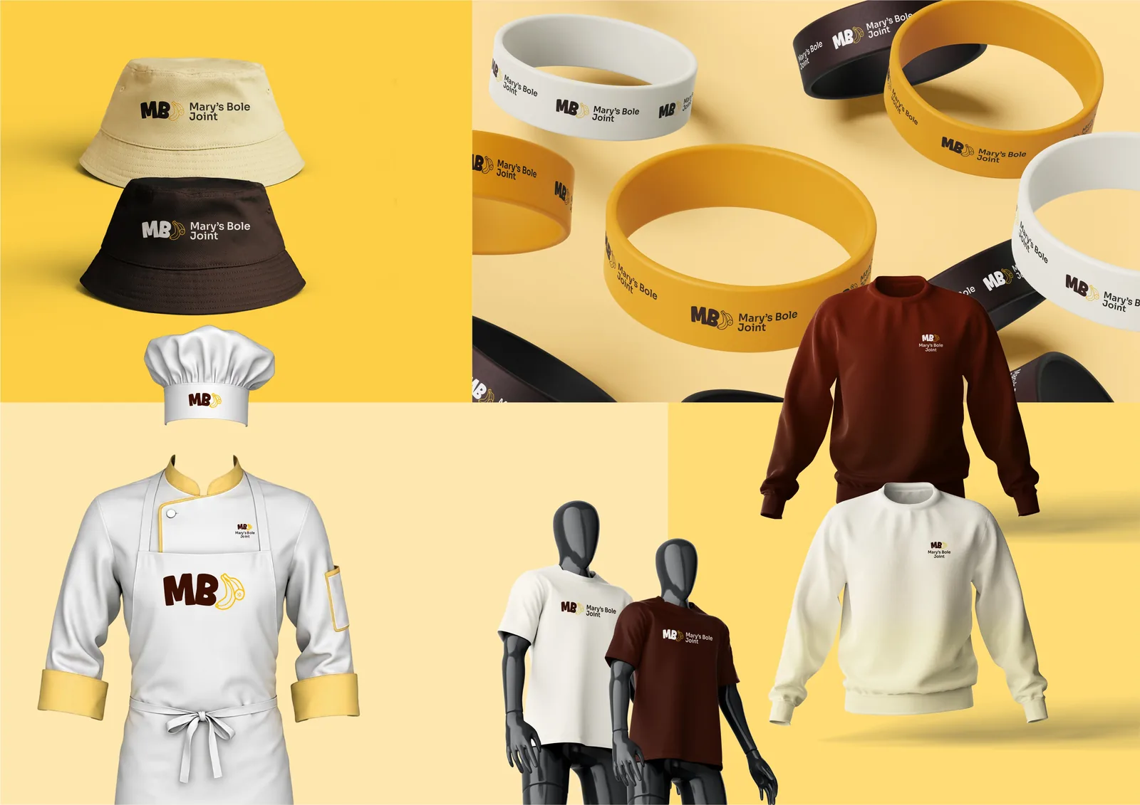
- Gazebo, merch and stationery
- Social media and photography direction
Result04
Identity delivered, 2025
Ready for the street, the stall and the feed.
The work05